
Saturday, July 30, 2011
Friday, July 29, 2011

SixtySeven-Office Space

I bought this pushpin stamp at the stamp extravaganza with making a card just like this in mind. This is one of my truly original ideas that I truly like.
SixtySix-Across Party Lines

No, I am not cheering for "compromise" happening in Washington finally. I am cheering for my cousin who was just chosen to run for board of selectmen for his party in his hometown this fall. Despite any political differences we may have, and honestly we've never really discussed the issue so who knows what if any those differences are, I love him and fully support what I'm sure is only the beginning of a long, successful career of public service.

Thursday, July 28, 2011

Monday, July 25, 2011
SixtyThree-Hi


The top one is my card and the bottom one is a card I saw in a magazine that was given to me to use for inspiration. Going through it I was honestly surprised by the number of "pre-crafted" items used to create these cards. Even this simple design in the magazine requires some kind of stones and rub on transfer letters. My more colorful version had neither.
Friday, July 22, 2011
SixtyTwo-Danielle

I ran out of the precut bookmarks and had to start cutting my own. But it gives me a variety of colors to work with which I think is pretty cool. Here is one I made inspired by someones business card. When I talk to her next if she says it's OK I will post the business card as well so you all can see the inspiration piece.
SixtyOne-For the Birds
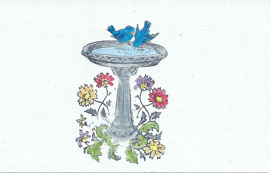

So these are nothing I've finished, just some cool things I wanted to play with just to see what they looked like. I will definitely keep these in mind for future applications. It's like Christmas in July right now, I don't know which "toy" to play with first!
Sixty-Joan


More examples of my need to learn the lesson "less is more". If I could go back I would probably not have filled in the letters with the purple background and I maybe would have gone more subtle with the box around the name on the birdhouse side. I thought I would love coloring in the birdhouse stamp but I like how it looks plain against the white background. Some of these new stamps I got are just amazing!
FiftyNine-Another Variation on a Previous Theme

This is a great combination of some stamps I already had combined with some new ones I just received. I don't know what it is about this particular flower stamp I love, but I do love it. This, by the way, will hopefully be my last time "cheating" by using each side of the book mark as a different piece. I really didn't coordinate these two sides though so they definitely stand apart as two separate pieces. The ones I'm working on now gel together slightly better.
FiftyEight-Chris

So I am back on my mission to create something for everyone in my new office. I started off making cards and it actually worked out because there was a spate of birthdays and even an engagement. But now I have these bookmarks so I am going to do the next bunch on those.
Thursday, July 21, 2011
FiftySeven-Circles

FiftySix-Thistles?

So I actually like this one and the parts I like the best are betrayed by my shitty scanner! The greens appear yellowish and the purples appear blueish but overall I like the design and green and purple are my favorite colors. See the next post for the much more simplified second side.
Wednesday, July 20, 2011
FiftyFive-Double Fail-But Still a Success (Part Two)

FiftyFour-Double Fail-But Still a Success(Part One)

So here is another case of me not being able to leave well enough alone. This was a somewhat acceptable piece but then I decided to add "just one more" touch, hence the hot mess at the bottom. You will see the same on the next piece which is the other side of this.
Friday, July 15, 2011

FiftyTwo-Self Portrait With Hair Dye and "Editor's Notes"
This is my shout out to the world to know that I am not pretending that I am not getting older. I don't (mostly) really care how I look to others but I do care how I look to myself and for whatever reason *advertising* I prefer to not have grey hair. So here is the ugly truth: I have started to grow seriously gray to the point that my family could no longer go "no, you're not, where?" with a straight face anymore. Just kidding my family could care less, but for some unknown reason *societal expectations* I just don't like the way that I, at the relatively tender age of thir-blurgh, aackk, ahem look with gray hair. So here I am in all my (double-chin up) glory for the world to see:


Thursday, July 14, 2011
FiftyOne-My Second Assisgnment

This is crooked but not as crooked as it looks because it is scanned crooked. One of these days I really am going to use the ruler. Anyway, this was an assignment (is there a better word?) from my mom who is attending the high school graduation party of one of her co-worker's daughters. The only direction I was given is that her favorite color is teal or which I couldn't really find any teal, well not until after I finished this one anyway, so I went with this cool blue and brown combination. I don't know why I am so into this combination but I am, my bedding is even a variation on this. Anyway, this was probably one of the more involved pieces as far as paper cutting went. I hope it's cool enough for "kids these days".
Sunday, July 10, 2011

FortyNine-Don't Look a Gift Horse(S is for Sorry)

These are prototypes of hostess gifts I was attempting to create for a party I was attempting to go to. A few of you might have heard of it. Anyway, I never finished the cards nor was I able to get to the party.
FortyEight-Unfinished

Friday night I felt like really working but couldn't really get anything to come together. Here are a few things I started but then either didn't like or didn't know what to do with.
Friday, July 8, 2011
FortySeven-Diamond in the Rough

More gum wrappers, this time giving me an excuse to go buy a square punch which is what I wanted all along, well, I actually had a different layout in mind, but when I first thought of using the gum boxes they were always squares in my mind. This time there's just the head of the little don't litter guy. I really like these, I may have to start chewing more gum, despite my dentist's wishes! Sorry Dr. Neil.
FortySix -Give a Hoot


I've said it before, I'll say it again-YIKES! I don't know what is wrong with my scanner that it makes everything look even worse than it actually is! Anyway, this is for my mother in law who loves owls. I just wish I had a better sense of color theory or something. Also, I wish I had thought to stamp all the letters on the front but, oh well! I am soldiering on.
Wednesday, July 6, 2011
FortyFive-Waste Not, Want Not

File this under: reduce, reuse, recycle. My friend Tina at work gives me all her Orbit gum packs because we like the designs on them. I have been saving them for almost a couple of months now and decided now would be a good time to put them to use. The middle row actually came from the backing of a pack of blank cards I bought but the top and bottom rows are from three different used packs. I still have plenty more so expect more in this series to follow. PS I love the little "don't litter" person. Is he copyrighted? He may have to be a signature going forward.
FortyFour-Home Sweet Home

Oh boy, here goes... So I lost my good corner rounder which explains the gnawed edges on the vellum and the maroonish piece. Also, I need to figure out what is the best way to stick vellum to another piece of paper without leaving all that glue behind, unless it looks different when it's had longer to dry, I don't know. Anyway, some cool new things: my friend Ellen gave me a boatload of stuff she wasn't really using including the cute house and heart punch. Though I think it must have been well-loved by her at one time because it only goes through the thinnest of paper like the vellum I used it on. Also, she gave me a super cool corner punch which is what I used on the light brown piece. Speaking of the light brown piece, it is card stock that comes in packs with adhesive backing already on it! Perfect for my lazy ass!
Monday, July 4, 2011


Subscribe to:
Posts (Atom)